Color vs B&W
Birds in B&W. Photo by @the_human_journey_ Used with permission. Click picture for a larger image.
Do you prefer color or b&w for your street photography? If you are trying to build a following on Instagram, or really just about anywhere, you best choose one. It turns out viewers are happiest when you meet their expectations. If they think of you as a b&w photographer, it will confound them if you post color and vice versa.
There is an Instagram photographer, @the_human_journey_, who has cleverly set expectations for viewers that both the color and b&w image will be posted together on each post of his gallery page. I was delighted when I found his Instagram gallery. First of all, I love to rise to the challenge of choosing my favorite, when given a choice of multiple images within one post. I was merrily going along choosing between his two versions when I realized that it was a great learning opportunity. I still choose between the two, but now my new rule is that I have to tell him why I chose one over the other. It was easy to have a preference. It was much harder to explain the preference.
Market in color. Photo by @the_human_journey_ Used with permission. Click picture for a larger image.
I asked to interview @the_human_journey_ and he graciously agreed. His answers are in italics.
How did you come up with the idea of posting in both B&W and color in Instagram?
When I started the account I was planning to post in B&W only but came to see that some images work better in color. I started posting every 4th image in color and the rest in B&W. At some point I realized that I don’t have to choose and can post the best of both words! I still keep the 3/1 B&W/color pattern for the main images but show the alternative for the swipable second image. I show both versions for nearly every image unless I think the other version really doesn’t work at all.
Do you usually favor one of the versions?
Yes, and that is generally the one I show first.
Do you know when you’re shooting which one will likely be the favorite?
Not necessarily. I tend to favor B&W unless the image catches my eye specifically because of its colors.
I often choose a favorite. Do we usually agree?
I’d say we agree about 75% of the time, so definitely a majority!
I asked for three sets of images from @the_human_journey_ . In one set he prefers the b&w image, in one set he prefers the color image and in one set it could go either way. I will always present the b&w image first. I challenge you to choose your favorite in each pair and tell yourself why you favor that choice before I tell you his choice and mine.
On the Subway in B&W. Photo by @the_human_journey_ Used with permission. Click picture for a larger image.
On the Subway in Color. Photo by @the_human_journey_ Used with permission. Click picture for a larger image.
Ice Cream in B&W. Photo by @the_human_journey_ Used with permission. Click picture for a larger image.
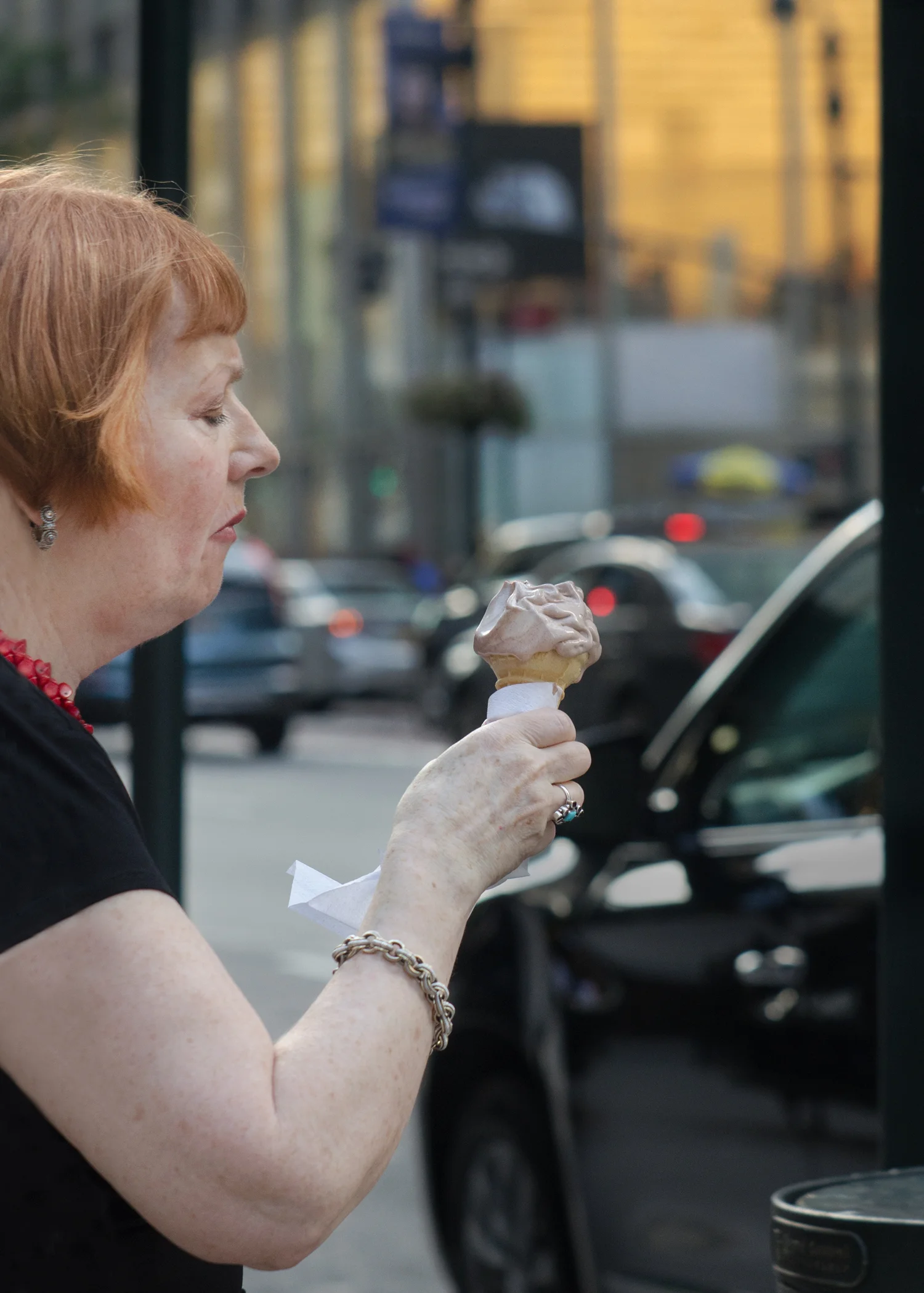
Ice Cream in Color. Photo by @the_human_journey_ Used with permission. Click picture for a larger image.
Little Boys and Peace or Victory in B&W. Photo by @the_human_journey_ Used with permission. Click picture for a larger image.
Little Boys and Peace or Victory in Color. Photo by @the_human_journey_ Used with permission. Click picture for a larger image.
The first set of pictures, On the Subway, is an example of two treatments that @the_human_journey_ thought could go either way, although he preferred the b&w. I agree that they can go either way, but my preference is the color. I really like to be able to lock onto a face. In the color that is easy for me to do. Also, the yellow frame works well for me.
@the_human_journey_ submitted the second set of pictures, An Ice Cream, as an example of color being the best choice. Oh, I so agree. This pictures deserves the joy of the color presentation.
The third set of pictures, Little Boys and the Peace or Victory Sign, are an example of the b&w being the preferred choice of @the_human_journey_ . Again, we are in total agreement. The little boys are much easier for me to lock onto in the b&w. In the color, the fluorescent yellow arrow is tremendously distracting for me.
I want to thank @the_human_journey_ for the time he took to answer my questions and gather and send the photographs. You can follow him on Instragram @the_human_journey_.
Exercise
If you are on Instagram, go to the account of @the_human_journey_ and choose your favorite rendition of three pictures. Think about why it is the one that appeals to you. As a special treat for me, tag me in the post @dianewehr.


